Materials for Template Production
Three things are essentially sufficient for producing user-friendly templates:
- Graphic template design in PDF (preferably) or otherwise defined specifications.
- Colors. Consider sending a brand/logo manual or a similar document with visual identity, if available. It could be just a page with colors, a screenshot of these colors, or colors listed in an email if you prefer not to share the entire document. I would set colors for the color theme accordingly. All color definitions for MS Office are in RGB or HEX.
- Fonts. If any unconventional/special fonts are to be used, please send them or specify/select the system font commonly found in MS Office.
Graphic Template Design in PDF
If you already have a graphic template design in PDF from a designer, that's ideal, and basically, sending me the PDF file is sufficient. I prefer this format for previewing and extracting everything I need from it—graphics, font sizes, and possibly colors. It's essential, however, that graphic elements such as logo, icons, etc., are inserted as separate, isolatable objects—ideally in vector format for maximum/lossless print quality and conversion to PDF, and texts as actual text—so it shouldn't be a graphic template design created as a single image including texts, where graphics and texts cannot be easily extracted.
If you don't have a specific template's graphic design but have, for example, a brand/logo manual detailing the appearance of letterheads (dimensions, font sizes, logo placement), PowerPoint presentations (slide previews), etc., I can also prepare templates based on that after receiving the logo and other relevant graphic elements. You can send whatever you have available from the designers, I'll review it and choose the appropriate format.
If you don't have graphic design drafts of templates in PDF or a brand/logo manual (just starting with visual identity), I can recommend reliable designers who create nice designs and collaborate well.
I leave the creative graphic part as part of the division of labor and specialization in graphics; I focus, on the other hand, on the technical part, breaking down graphic designs into components and assembling them into user-friendly templates.
Colors / Color Theme
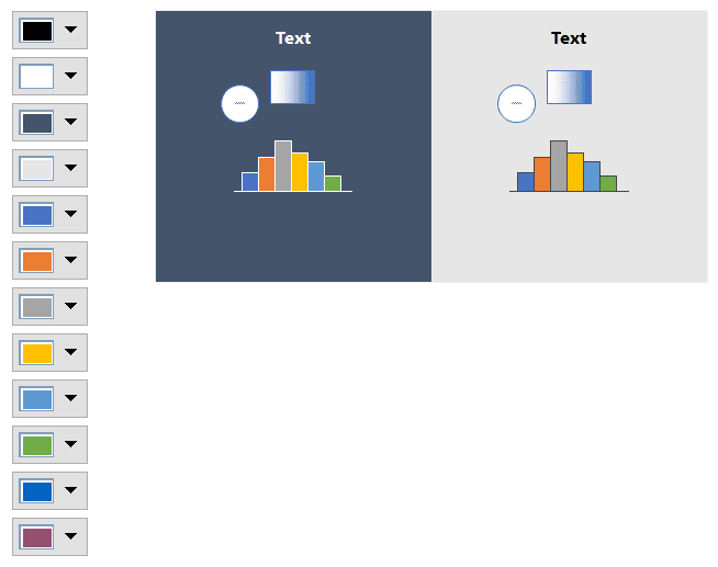
In MS Office, you can generally set 2 + 2 primary colors (usually black, white, and perhaps dark and light gray) and 6 highlighting colors. These 6 highlighting colors, for example, automatically color graphs (as well as tables and other objects), and the order of colors matters— you can imagine it as when you insert a bar chart with 1 column, it will have the first highlighting color, with 2 columns it will have the first and second highlighting color (in this order), etc., as can be seen in the image below in the Example section on the right.
All colors in MS Office are defined in RGB or HEX.

Figure 1: Example of Template Color Theme and the Use of Highlighting Colors in Graphs
Fonts
Fonts that are not commonly found in Windows/MS Office are best installed for all template users. Although fonts can be inserted directly into the template under certain circumstances, it has two potential disadvantages:
- It may not be possible with some licensed fonts; and
- The size of the empty template will increase—for example, the size of a letterhead template, which could be just 50 KB, may increase to several MB, which is not suitable for storage (each individual file created from the template will unnecessarily occupy more disk space) and sending by email, etc.
Various licensed fonts, Google fonts (installation recommended in both cases), or fonts directly in Microsoft Office can be used. You can find out which fonts they are, for example, from Word > Design > Fonts - Office, or a broader overview of fonts is provided on the Microsoft website, for example, here: https://learn.microsoft.com/en-us/typography/font-list/. The advantage of system fonts is that they are maintenance-free, without the need to maintain installations for all users. The disadvantage is that other fonts may be more interesting.